|
by Alex Perkins
Our department is currently considering the possibility of some changes to our graduate curriculum, which could include reductions in coursework requirements. These changes are motivated by a desire to empower our students to devote more of their time to their research, given the importance of that for enabling them to be productive in grad school and successful in their future careers. One concern that has arisen during these discussions is how reductions in coursework requirements might impact enrollment in the graduate classes we offer. That concern could affect how much of a reduction in coursework we adopt and inform strategies that we might take to mitigate the impact of a coursework reduction on enrollment in graduate classes. Either way, this is a question that our graduate curriculum committee felt would benefit from some modeling.
Our graduate curriculum committee thinking through all scenarios to avoid a bad outcome for our department. We hope that we’ll arrive at a better outcome than this cat!
Defining the parameters of the model
The first thing we had to think about is what factors play a role in determining enrollment in our classes. This influences which parameters need to be included in our model.
Some parameters that are within our control as a matter of policy include the following.
Parameters that are, for all intents and purposes, beyond our control include the following.
Average enrollment per class
With these parameters specified, a natural thing to do is to calculate average enrollment per class.
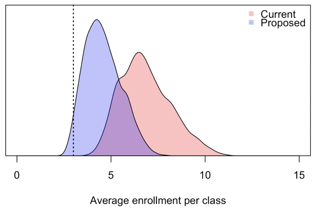
To do that, first take the number of students per cohort (25) and multiply it by the credit hours required per student (21) to get the credit hours required per cohort (525). Those credit hours get divided over how many semesters students take classes (4) and multiplied by how many cohorts are taking classes in a given year (2), resulting in credit hours taken per semester (262.5). Not all of those credits are taken in our department (80%), resulting in the number of credit hours taken by our students in our department each semester (210). Most classes have historically been offered for 3 credits, giving us the number of classes taken by students in our department each semester (70). Undergrads and grad students from other departments also take our classes (20), resulting in the total number of all students taking graduate classes in our department each semester (90). Dividing that by the number of classes offered per semester (13.5) gives us average enrollment per class (6.67). This illustrative calculation was based on the midpoints of the ranges of each parameter. How much variability in average enrollment per class is there based on variability in these parameters? To assess that, we can perform this calculation repeatedly using Monte Carlo sampling of parameters from their ranges.
Variability in average enrollment per class. This variability is due to variability in several factors that affect enrollment. Distributions are shown under current (red) and proposed (blue) coursework requirements.
Doing this shows that 95% of parameter combinations result in 4.7 - 9.7 students per class under our current requirements (24 credit hours over 4 semesters) and 3.0 - 6.5 students per class under the proposed requirements (12 credit hours over 3 semesters). Although the proposed requirements would lower enrollment, the average would mostly stay above 3 students per class, which is a minimum that we would like all classes to remain at or above. Thinking beyond averages
Looking at average enrollment under different scenarios is helpful for getting a rough idea of the consequences of alternative policies, but it does not tell us what we really want to know. If average enrollment is above our minimum of 3, but 40% of classes have 2, 1, or even 0 students, that’s bad. What we really want to know is the proportion of classes that would have enrollment below our minimum of 3 students per class.
To quantify that, we can take many of the same steps as in the calculation of average enrollment per class. Specifically, I have boiled this down to the following question. If there are X students taking Y classes each in a given semester and there are Z classes being offered, what proportion of classes will have fewer than 3 students? For a given set of parameters, this can be simulated by allowing each of X students to randomly select Y classes from the set of Z classes being offered by sampling classes without replacement and then counting up what proportion of the Z classes end up with fewer than 3 students. X, Y, and Z all depend on parameters of the model, which leads to differences in the proportion of classes with fewer than 3 students as a function of differences in the model’s parameters. One additional assumption that needs to be specified is whether some classes are more popular than others. Although it would be possible to estimate heterogeneity in class popularity based on past enrollment data, I have not taken the time to do that. Instead, I assigned each class a relative popularity such that the top 10% of classes attract twice as many students as the bottom 10% of classes, on average.
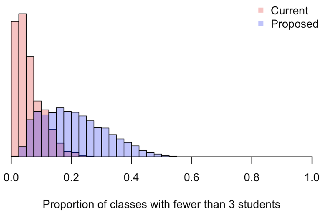
Variability in the proportion of classes with fewer than 3 students. This variability is due to variability in several factors that affect enrollment. Distributions are shown under current (red) and proposed (blue) coursework requirements.
Based on our current requirements, the model predicts that 5% (95% uncertainty: 0 - 17%) of classes that we currently offer end up with fewer than 3 students per class. Although we have not looked at data on how often classes that are currently offered end up with fewer than 3 students, it is possible that a small proportion do. Professors may either offer those classes anyway or not end up teaching them. Regardless of whether this baseline prediction is correct, we can still use these calculations to get a sense of the relative impact of a change in coursework requirements on the proportion of classes with fewer than 3 students. Under the proposed change to 12 credit hours over 3 semesters, the model predicts that 20% (95% uncertainty: 5 - 43%) of classes that we offer would end up with fewer than 3 students per class. Whether this is correct in an absolute sense, this amounts to a prediction that changing our coursework requirements could lead to an approximately fourfold increase in the proportion of classes with fewer than 3 students. Can we make the proposed changes work?
There are a few strategies that could be taken to mitigate the impact of the proposed coursework reduction on the proportion of classes with fewer than 3 students. How much of a difference would those mitigation strategies make?
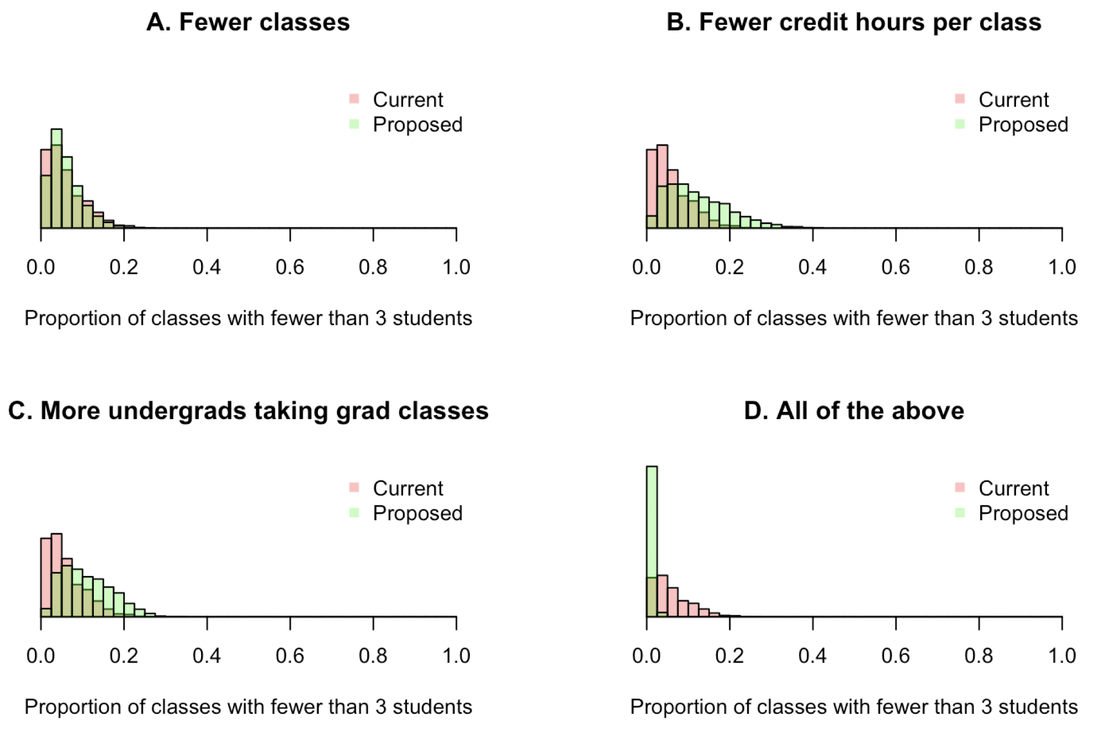
Along with a reduction from 24 credits over 4 semesters to 12 credits over 3 semesters, consider the following mitigation strategies. A. Reduce the number of classes offered per semester. This could be achieved by encouraging more co-teaching or having some faculty teach an undergraduate class in lieu of their graduate class. Consider a reduction from the current range of 10-17 to a new range of 8-10. B. Reduce the credit hours per class. Reducing this from 3 to 2, or having more of a mixture of 2 and 3 credit classes, means that students would take more classes to meet their credit hour requirements. C. Increase the number of undergraduates taking graduate classes. With some effort to recruit additional undergraduates, as well as grad students from other departments, consider an increase from the currently assumed range of 10-30 to a new range of 30-40. D. All of the above.
Effects of different mitigation strategies on the proportion of classes with fewer than 3 students. Variability in each distribution reflects variability in these and other model parameters.
The mitigation strategy with the biggest effect appears to be reducing the number of classes that are offered. This alone could offset the effects of reducing coursework requirements on class enrollments. The other two strategies are also capable of helping, albeit to a somewhat lesser extent. In combination, all three of these mitigation strategies could reduce the number of classes with fewer than 3 students even beyond what it is now. Take-home message
The graduate curriculum committee’s proposal to reduce coursework requirements from 24 credit hours over 4 semesters to 12 credit hours over 3 semesters would have an impact on class enrollment. From the perspective of the proportion of classes with enrollment below an acceptable minimum of 3 students per class, this change in policy would increase the number of classes in this category by approximately fourfold.
Three different mitigation strategies each have potential to offset these undesirable changes. With a concerted effort to reduce the number of classes offered, reduce the number of credit hours per class, and boost enrollment from undergraduates and grad students outside the department, average course enrollment could increase by 46% and the proportion of classes with fewer than 3 students could decrease by approximately tenfold. Both of those changes are relative to current enrollment, meaning that enrollment could actually increase relative to what it is now, despite a major reduction in coursework requirements. In conclusion, this analysis suggests that with a multipronged approach, our department could simultaneously reduce the coursework burden on its students (thereby increasing their research productivity) and increase enrollment in our classes (thereby enhancing the viability of a greater diversity of classes).
With the right updates to our graduate curriculum, we all stand to benefit!
Thanks to the graduate curriculum committee for many helpful ideas that informed this analysis. The committee is co-chaired by Beth Archie and Cody Smith and also includes Jeni Prosperi, Matt Ravosa, Jason Rohr, Felipe Santiago-Tirado, and Siyuan Zhang.
by Alex Perkins
Every year, our department hosts a graduate recruitment weekend, during which we bring in 50-60 prospective grad students for an on-campus visit and interview. There are a variety of activities scheduled over the course of this 48-hour period, with one of the most important being one-on-one interviews of prospective students by faculty members. With 50-60 students and 30+ faculty members, scheduling 30-minute interviews in a 3 hour 30 minute window is always a challenging task. When it was my turn to get involved in this scheduling process, I decided that there surely had to be a better way to do this than by hand. To try to come up with a tool that would make this job easier for me and those who come after me, I wrote an R script to automate this process. Here, I describe how that algorithm works and note some observations made along the way. Note: To make this description more vivid, I made some mock inputs based loosely on inputs that were actually used in our interview scheduling process. For fun and in the interest of anonymization, I’ve replaced student names with those of All-American Notre Dame football players, faculty names with those of characters from popular movie franchises categorized by admissions group, and research areas by oddball “-ologies.” Note that gender of characters does not necessarily correspond to gender of faculty members, and whether a character is a hero or villain was chosen arbitrarily and does not reflect my opinion about anyone! Inputs
Like any algorithm, the quality of the inputs is crucial to the quality of the schedule this algorithm generates. One of the most important inputs is a set of requests by individual faculty to meet with certain students. In addition, we have suggestions from faculty about meetings that would be good but are not crucial. Another important input is a list of preferences for certain faculty members indicated by students in their admissions applications. Other inputs include research areas indicated by both faculty (on the departmental website) and students (in their applications), as well as GSAC group affiliations of faculty and students. GSAC is our graduate student admissions committee, which consists of five faculty members who represent themselves and other faculty in department-level discussions and decisions about graduate admissions.
Other inputs to the algorithm are related to constraints on what can be scheduled. The biggest one is if certain faculty members are not available during some time slots. Another is if a very small number of faculty request one-hour meetings with students, which happens occasionally when faculty admit students directly into their lab (i.e., no rotations) and work on research that is highly specialized and non-overlapping with other labs.
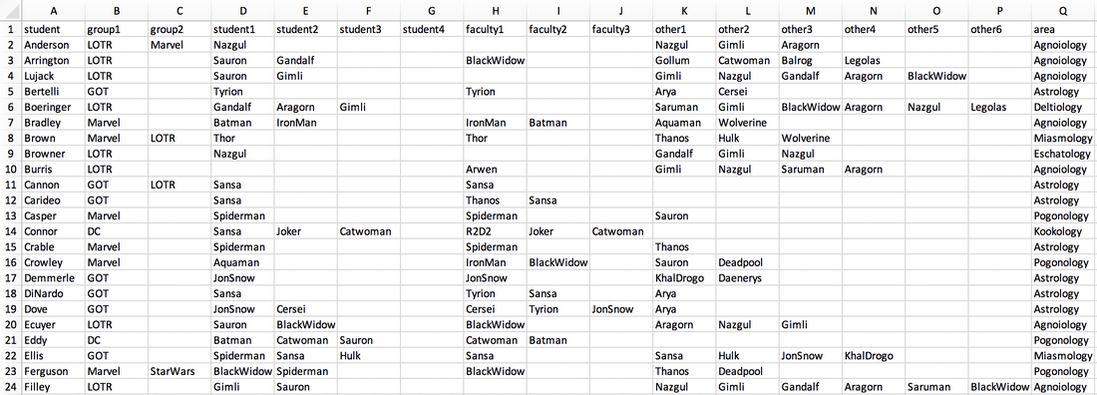
Inputs to the scheduling algorithm. The “group” variables refer to GSAC group affiliation, the “student” variables come from expressions of interest in faculty in student applications, the “faculty” variables come from specific requests by faculty to meet with a student, and the “other” variables come from suggestions by faculty for meetings that are recommended but not required. The area column indicates the research area identified by the student in their application, which maps onto research areas with which faculty identify on our departmental website.
Pre-processing
Other than assembling the inputs in the right format, there is only one other step that is done by hand: deciding what times each student has a meeting. This is done arbitrarily but with the goals of spreading the meeting times out somewhat, making sure that all students get about the same number of meetings, and making sure that every faculty member is in a meeting during a time slot when they are available. Although this step could probably be automated somehow, I have found it easy enough to just do by hand.
Deciding who meets with whom and when
This is the hard part.
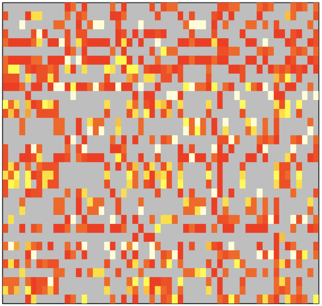
The first step involves the construction of an affinity matrix, which describes the strength of the match between each individual faculty member and student. It is constructed by adding points for matches in terms of each of several inputs.
Affinity matrix used to describe the strength of matches between faculty and students. Affinity from high to low is colored white, yellow, orange, and red. Gray indicates an affinity of zero, meaning that the faculty and student do not have any overlapping research interests.
The next step is filling the schedule. Any hour-long meetings are hard-coded into the schedule first. Then, for an arbitrarily chosen time slot, the affinities of all pairings involving students meeting at that time are looked up. Meetings are then set in order of the highest affinities among available faculty-student pairings. When there are multiple pairings that all have affinities equal to the current maximum affinity, a single pairing is chosen randomly from that set. Once a meeting is set, it and all other pairings involving that faculty member and student are removed from consideration during that time slot. Meetings between that faculty member and student are also disallowed during other time slots. Once all meetings during that time slot have been set, the algorithm moves on to another time slot and repeats this process.
Example schedule generated by the algorithm. Schedules from the faculty perspective are also generated. A separate script not described here was developed by Stuart Jones to convert these spreadsheets into more esthetically pleasing, individualized schedules for each student and faculty member.
Dealing with constraints
There are a number of hard constraints in the algorithm. One that is set a priori is which faculty are available during each time slot. If fewer faculty are available during a time slot, then there are fewer options for which meetings can take place. Furthermore, faculty-student pairings already set during another time slot cannot take place during a subsequent time slot, even if their occurrence in that subsequent time slot might be better in some way (e.g., freeing up time for some other meeting that would not otherwise occur). As mentioned previously, pairings available at the same time can have equal affinities, yet one must be chosen first. If two or more of those pairings involve the same faculty member or student, which of those pairings get chosen will have implications for which meetings can occur in that or subsequent time slots. Last, which students happen to have meetings during a given time slot affects which meetings can or cannot take place.
The fact that there are so many of these constraints and that they are so sensitive to arbitrary choices about ordering makes this problem a prime candidate for automation. Why? While it would be possible (although tedious) to implement this algorithm by hand, doing so would involve numerous arbitrary decisions about ordering. Because it is so hard to make guesses about all the downstream consequences associated with each arbitrary choice, it would be difficult to know whether an optimal choice is being made. The beauty of automating this process is that we can easily perform it repeatedly, trying out thousands of sequences of those arbitrary choices in a matter of a few minutes and choosing only the best one in the end.
The beauty of automation. Rather than perform a tedious task once by hand, automation allows for many instances of this procedure to be performed very rapidly.
Choosing the best
After generating thousands of different schedules based on thousands of different sequences of arbitrary choices, how do we decide which schedule we actually want to use? There are a few different ways I looked into scoring each of the thousands of possible schedules.
The first was to add up the affinities of all the meetings and select the schedule with the largest of these sums. One concern I had about going with this way of scoring is that it was unclear where the high total affinity was coming from. Lots of good but not great meetings? A few really great meetings at the expense of many that are a poor fit? Something else? The second was to calculate the proportion of meetings between faculty members and students with an affinity of zero and try to minimize how many of those take place. While I do think that is something we would like to try to minimize, it appeared that choosing a schedule based on this criterion resulted in some really important meetings not taking place. The third was to calculate the proportion of meetings requested by faculty members and try to maximize how many of those take place. In the event that our schedule does not include meetings specifically requested by faculty, we are going to get complaints and have to make adjustments by hand after the schedule has been drafted. In the end, I went with this option and afterwards performed adjustments by hand to meetings that were a poor fit. How well did the algorithm perform?
It is difficult to know whether we have arrived at an optimal schedule in the sense that there is no other possible schedule that is better than the one we select. And as mentioned previously, there are different criteria by which to evaluate how good a schedule is, with an optimal schedule in one sense likely being suboptimal in some other sense. Also very importantly, if there are shortcomings in the inputs used or the way in which the algorithm makes decisions, then it might be possible for a schedule to be devised by hand that would be perceived to be better by human judgement.
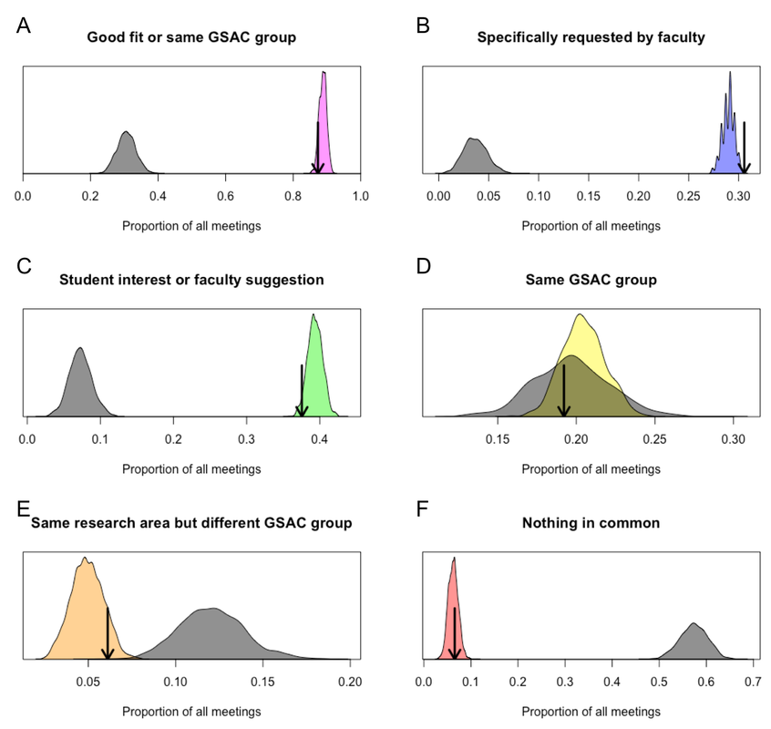
With all those caveats in mind, I calculated the proportion of meetings of different types in each of 10,000 replicate schedules that were generated by the algorithm. These are shown by the colored distributions below. Within each of those colored distributions, the black arrow indicates the performance of the one schedule that was chosen in the end on the basis of maximizing the number of meetings that faculty specifically requested. As a point of comparison, I reran the algorithm with a completely flat, uninformative affinity matrix to generate a comparable null distribution, which is shown in gray.
Performance of the scheduling algorithm. Performance was assessed in terms of the proportion of meetings falling into different categories shown in each panel. A single schedule that we actually used was chosen based on the criterion in B.
Compared to the null distribution, the algorithm led to the greatest improvement in the proportion of meetings that satisfied specific requests by faculty. This is no surprise given that these meetings were prioritized most heavily in the affinity matrix. The algorithm also performed very well in making meetings happen between students and faculty that they expressed interest in, as well as meetings that faculty thought would be good but were not strictly required. Meetings between students and other faculty in the same GSAC group occurred at frequencies similar to the null distribution. Meetings with faculty outside of a student’s GSAC group occurred about 10% of the time, with about half of those at least being with faculty with a shared interest in some broad research area. Last, whereas random matching would have resulted in nearly 60% of meetings being between students and faculty with no common research interests, the algorithm reduced that proportion by around ten-fold.
Was creating this algorithm worth the trouble?
Although developing this algorithm certainly took some time, I found that time to be much more enjoyable and rewarding than if I had done this task by hand.
Now that this algorithm has been developed, I feel reasonably assured that we are getting about as good of a schedule as we can given various constraints. Had I done this by hand, I think I would have had more doubts about whether I could have done a better job, just because doing it by hand doesn’t provide a straightforward way to compare among alternatives. Another benefit of this algorithm has been the ability to refine inputs and quickly generate a new schedule. Upon reviewing a first draft of the schedule, Siyuan Zhang noted a number of poor matches among faculty and students outside my area of research. He was then able to make some suggestions about students and faculty who would be better matches, which I was able to use to quickly generate a new schedule that resolved a lot of the problems with the first version. This second version was certainly not perfect, but the problems with it were fairly isolated and relatively easy to address by hand. This is the second year that I have used this algorithm. It was certainly much easier to brush up on the code and rerun on new inputs than it was to write it from scratch last year. I also made a few updates, which led to some improvements in performance. Next year, I anticipate that this process will be even easier. The more years we end up using this algorithm, the greater the benefits of this investment in automation will be.
By Guido España
IntroductionThere are several difficulties for researchers who try to replicate findings from other researchers. For instance, the instructions could be incomplete, and the code and data might not be available. ELife’s first computational reproducible article aims to solve this issue by allowing readers to interact with code that generates every figure in the paper. This open-source project (Stencila) is a step towards reproducible research. However, there are other obstacles that authors need to address in their work habits to be able to produce research findings that can be reproduced by others, but more critically, by themselves. Five obstacles towards reproducible researchPublishing a manuscript is an iterative process with several steps that go from a preliminary idea, an initial draft, and to, hopefully, publication. This long process involves many changes in the manuscript, code, and figures. These changes are due to numerous revisions from collaborators and journal reviewers, or from the researchers themselves. Many things can get on the way of reproducibility. Personally, I have experienced problems with keeping results up to date because often there are misconnections or manual steps in the process of gathering and analyzing data, and creating figures or tables. It is particularly difficult to remember all the steps to create a figure several months after the first draft of the manuscript. In my opinion, there are five main obstacles in the path of reproducible computational research: 1. Keeping results up to date, 2. Remembering previous versions of the manuscript, 3. Collaborating with co-authors, 4. Responding to reviewers, 5. Sharing reproducible research with other researchers. File managementThe first step towards reproducibility is file management. It is very important to name files in such a way that they are easy to understand for humans and computers. Files also need to be easy to recall. For humans, this means that names should be meaningful, for computers, this means that files should not contain strange characters (spaces, commas, periods, or others like #$%^). Directory structure is important to keep research files organized. For instance, to differenciate the manuscript files from the scripts and data, one could have a main directory ( Make filesGNU make is a tool to compile files (often executable files) that depend on many other files. GNU make is often used For emacs enthusiasts, org-mode is a powerful alternative. See this tutorial for an introduction to manuscript writing with org-mode. PandocUsing LaTeX (or knitr, or org-mode) would be ideal for anyone collaborating with a team of LaTeX users. However, this isn’t always the case. In many fields, MS Word is the prevalent word processor. If you want to use the capabilities of git and LaTeX, but you still want to share word documents with others, pandoc is probably the best alternative to convert between .tex and .docx documents. A brief introduction for this purpose is Alexander Branham’s guide to pandoc. Using pandoc, LaTeX documents can be converted to MS Word to share with collaborators, then their changes can be incorporated into the main LaTeX document. GitHub/GitLabGitHub or GitLab can be used to create a remote repository and share it with collaborators. If the workflow to create the manuscript has been automated, then sharing with others should be straightforward with GitHub or GitLab, where other researchers could replicate the manuscript results and use them in their own research. To share with the scientific community, a manuscript published in a scientific journal could include the URL for the GitHub repository with all the necessary steps to create the manuscript. Other resourcesThis post is a brief summary of tools useful for reproducible computational research. A lot of the content on this post comes from Gandrud’s book on reproducible research. I also created some slides and some demos of reproducible manuscripts using the tools mentioned here: LaTeX, knitr, and org-mode. You can download the slides here. Furthermore, there are many more materials online that are helpful:
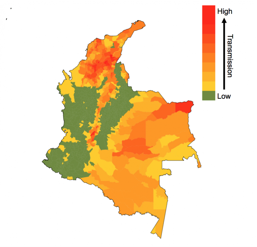
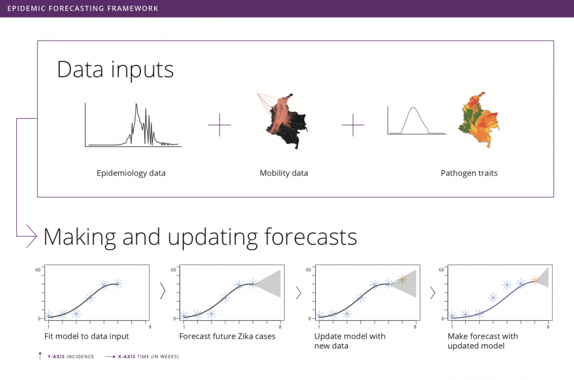
by Rachel Oidtman, Alex Perkins, Moritz Kraemer, Manuel Garcia-Herranz, and Elisa Omodei Originally published on: https://www.unicef.org/innovation/stories/epidemicforecasting The decision to grab your umbrella as you head off to work in the morning is shaped by the daily weather forecast. Although meteorology has been a formal science since the 19th century, it was only in the last 20 years that these forecasts became accurate enough (>60% accuracy) that we could trust them and use weather forecasts to make decisions. In the background of our daily lives, there has been a “quiet revolution” in weather forecasting, kick-started by a number of technological and scientific advances over the last few decades. With considerable technological advancements across all scientific disciplines, including a vast increase in the amount of data and more realistic models, meteorology is the only field that has achieved such clear success when it comes to forecasting. This begs the question: What if we could forecast influenza with the accuracy of rain forecasts? Or, what if we could forecast an emerging disease with the accuracy of hurricane forecasts? Weather forecasting as a model for epidemic forecasting With hurricanes, meteorologists know the seasons in which they occur, but they cannot begin forecasting the progression of a hurricane system until the first signs of a storm appear (i.e. low pressure system with thunderstorms during hurricane months). Early on in hurricane forecasts, there is significant uncertainty surrounding both the spatial trajectory and severity of the storm. With weekly weather forecasts, meteorologists know seasonal weather patterns and have extensive geographic data on weather variables. There is uncertainty around weekly weather forecasts, but this is much more constrained than hurricane forecasts. Building and improving upon both hurricane and weekly weather forecasts, meteorologists collect more data, invest in better satellites (collecting more precise data), and consider more models. Learning from the ways in which meteorologists improved both extreme and seasonal weather forecasts, it becomes clear that better models and more data could help to improve disease forecasting. Traditional disease surveillance data though cannot be collected as efficiently and consistently as weather data. Hence, the scientific community is devising more creative options to improve disease surveillance and epidemic forecasting. One such option is to use unconventional data sources (e.g. human mobility data, social media traces, web searches, etc.) to represent biological processes (e.g. pathogen dispersion) to enhance the realism of assumptions about disease spread in forecasts. Another complementary option is to organize forecasting “challenges”, which promote the development of more accurate models and offer a means to compare the accuracies of different models. Forecasting familiar and foreign foes Even with the sparse and varied nature of epidemiological data, there has nonetheless been progress in disease forecasting of both recurring seasonal diseases and emerging diseases. “Familiar foes” that exhibit recurring, seasonal transmission, such as influenza and dengue, have received considerable attention. One of the first major initiatives was Google Flu Trends, launched in 2008, which used Google search queries to forecast flu incidence. Since then, there has been consistent progress as academic researchers have been steadfastly working on developing more and more accurate models. The most notable example is the CDC-developed flu forecasting initiative, “FluSight”, that is used as a platform for visualizing and sharing real-time weekly flu forecasts contributed by various modeling teams around the world. Dengue has also been at the center of attention of the scientific community since the Dengue Forecasting Project was launched in 2015 - a forecasting contest based on historical data. “Foreign foes” that appear with little warning and can spread rapidly across international borders remain a more elusive challenge for disease forecasting, with recent notable examples including Ebola and Zika viruses. Chikungunya, a mosquito-borne disease that spread across the Americas in 2013-2015, offers another example. While retrospective analyses indicated some success with forecasting the sequence in which different islands in the Caribbean would be invaded, a near real-time forecasting challenge sponsored by Defense Advanced Research Projects Agency (DARPA) showed that most models tended to have difficulty forecasting other features of the epidemic, such as the week in which incidence would peak. Forecasting was also performed in support of the Ebola epidemic around the same time in West Africa, although somewhat controversially. Human movement and forecasting A variety of biological characteristics among different pathogens may contribute to variation in how difficult they are to forecast. For example, outbreaks of some diseases depend almost exclusively on human contact (e.g. influenza), whereas others involve frequent spillover from animals (e.g. MERS). One way to advance the science of forecasting across such a wide range of infectious diseases is to focus on challenges that are common to forecasting of many pathogens. One such challenge is capturing the role of human movement in pathogen spread. Consider an emerging disease, such as Zika. Early on in its epidemic in the Americas, there were a very limited number of locations that had confirmed the presence of Zika virus. Theoretically, if there was no human movement in or out of these locations, then the pathogen would have been restricted to these isolated locations (mosquitoes are also involved in Zika virus transmission but tend not to move very far). Because there is regular movement between locations, Zika virus can spread to new locations with humans as they travel for work, leisure, etc. Nowadays, this is possible thanks to the huge amount of data that each of us generates using portable technology. Every time we make a phone call or post a picture on Instagram, we are recording our location. If today someone makes a call from Bogotá, and tomorrow a call from Cali, the phone company knows that one person has traveled from one city to the other. Aggregating this information across many users, telephone companies can provide UNICEF and other stakeholders with anonymized data on human mobility patterns across an entire country in real time. Forecasting vector-borne disease outbreaks at UNICEF Since spring 2018, the Office of Innovation at UNICEF has been working with academic researchers at University of Notre Dame and Boston Children’s Hospital to meld together epidemic modeling approaches with innovative data sets to help the most vulnerable. Together, we developed a forecasting model for Zika in Colombia’s more than one thousand municipalities. In each municipality, we use a basic model that takes into account the environmentally driven nature of Zika virus transmission, and the accumulation of population immunity as the epidemic grows, to generate incidence forecasts. Across municipalities, we aim at modelling the spread of Zika virus using human mobility patterns that can be obtained from anonymized and aggregated cell phone data like that provided by UNICEF’s partner, Telefónica. To explore the real-time capabilities of this forecasting model, we iteratively fit the model, make forecasts, and update our model as new incidence data becomes available. As this collaborative venture continues together with UNICEF Colombia, our goal is to develop a user-friendly interface where public health officials from the Colombian Ministry of Health and National Institute of Health can plug in surveillance data and use our technically sophisticated modeling machinery to make forecasts for future Zika epidemics. This information will be used to make faster decisions on planning and prioritizing preparedness and response actions, thereby helping prevent the spread of such epidemics. The plan is to soon extend this work to include forecasts for other vector-borne diseases currently affecting Colombia, such as dengue and malaria. These forecasting tools will become a core component of MagicBox - UNICEF’s open-source software platform that enables collaboration and the use of new data sources and computational techniques, like AI and machine learning, for good. Recent Zika epidemics in Angola and India serve as a reminder that the threat posed by Zika is, unfortunately, not over. In this regard, the results from this collaboration will have direct implications for policy and public health.
This project builds on prior research funded by a RAPID grant from the National Science Foundation and a Branco Weiss Fellowship. by Guido España A Shiny App is a package to build interactive web-based applications in R. In science, a Shiny App is a great tool to share research results. In this post, I will walk you through the basic steps to design and publish a shiny app. I will use part of my research as an example. Some contextThe only dengue vaccine licensed has shown an issue with post-vaccination infections. Dengvaxia, developed by Sanofi Pasteur, increases the risk of severe dengue in children with no prior exposure to the dengue virus. Given this negative effect, the WHO recommends Dengvaxia only for children with confirmed prior exposure to dengue virus. In our study, we determined the public health benefits of this type of vaccination. We modeled vaccination in children with a positive result of previous dengue exposure using a wide range of accuracy of the serological screening tests. We explored this vaccination strategy in several levels of transmission intensity. Due to the noisy nature of our simulation outputs, we used a random forest model as an emulator to smooth the outputs. With this emulator, we calculated the number of cases averted and cost-effectiveness of vaccination programs. In this post, I will use our approximated model for the number of cases averted. To learn more about our research, go to the pre-print of our manuscript in BioRxiv. Also, check out our web-application to explore different scenarios with the model. In this tutorial, I will use data from our model to estimate the number of severe cases averted with vaccination over a 30-year period. I will use this data in a Shiny App that controls the parameters of the model. Finally, I will describe how to publish this app online. This model and all the code from this tutorial is available to download on Github. To follow this tutorial, you will need to install: 1. The modelWe first load the randomForest library, set a random number seed, and load the model.
Our model includes five variables:
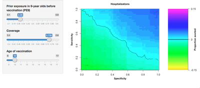
The number of severe dengue cases averted depends on each of these parameters. For instance, vaccination would avert 12% of cases using an 80% sensitive and specific screening test, with a coverage of 80% in a setting with 70% of 9-year-olds with previous exposure to dengue virus. Try it yourself.
2. Designing the Shiny AppThe goal of our Shiny App is to allow users to estimate the benefits of vaccination by exploring different vaccination scenarios. Our Shiny App consists of two components, the user interface and the server. The user interface receives the user’s input and sends it to the server to process. In this tutorial, we will use separate files for each function and save them as: ui.R and server.R. 2.1. The user interfaceOur user interface consist of a side-bar where users can adjust the value of the model variables and a main section where the results are displayed. Our application has three sliders to specify the transmission intensity of the region to vaccinate, coverage of the intervention, and the age of vaccination. We specify the sidebar in Shiny with the function sidebarLayout and sidebarPanel. This creates a space for us to locate the sliders for the user. Each slider is an input that the server will later use to create the main plot. The function sliderInput links the input value to the server with an inputId. Input values can be continuous or discrete (steps argument). The minimum and maximum values of the sliders correspond to min and max, respectively. The default value of the slider is called value.
The function mainPanel specifies the main region where our plots are located. You can add the plots to this panel by using the plotOutput function. This function needs to be specified in the server.
Finally, we put these two pieces together in a fluidPage layout and assign it to a variable named ui.
2.2. The serverThe server reads the input and process it to generate the output.
In this case, the server reads the input values of the three sliders, renders a plot and assigns it to the plotAverted component of the output.
The server reads the sliders' input by using the inputID. For instance, age can be accessed using input$Age. The function plot_averted_heatmap uses the random-forest model and the inputs to create the main plot. In this plot, the X-axis corresponds to the specificity of the test and the Y-axis to the sensitivity.
So far, I have created two files, one for the user interface and one for the server. The function runApp() launches the app in a local computer. Without any arguments, the app looks for the files ui.R and server.R in the current directory. You can download the server.R and ui.R files from my repository on Github.
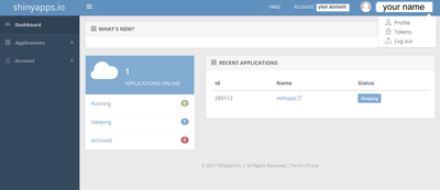
3. Publishing the Shiny AppUp to this point, you should be able to run the app on your computer. But, it might be not a good idea to share this app with others. To run the app your users need to have installed R and all the necessary libraries. Publishing the app to the web allows you to share your app with a wider audience. There are many ways to host Shiny Apps online. To start, I recommend using Shinyapps.io. It hosts web apps for free and the setup is straightforward. However, the free version comes with limitations. For instance, it allows only one user at a time. An alternative is to host Shiny Apps in your own server. If you are in a university, you could use a virtual machine provided by your university for free! In the next section of this tutorial, I will describe these two options. 3.1. Shinyapps.ioFor a more detailed guide, follow the tutorials for Shinyapps.io. You need to create a shinyapps.io account in https://www.shinyapps.io. After creating your account, go to the dashboard, click on the account icon, and select Tokens. Choose your token and click show, then click on show secret. Copy the command and paste it in your R script.
Now, we need to install rsconnect package in R and load the library.
To deploy the app, you simply run the deployApp() command after setting your directory to the app directory. Your app should be in shinyapps.io/name/appname. 3.2. Setting up your own serverWith shiny server you can host and manage your web application in your own server. Currently, shiny server is only supported in Linux systems. Detailed instructions can be found in the shiny server user’s guide. The following steps are in the command line. So, login to your server through SSH and continue below. You first need to install R and the shiny package. This can vary depending on your system. For ubuntu you can use apt or apt-get.
You can specify a secure default CRAN mirror in the file ~/.Rprofile
Now, we need to install shiny. For this you can start an R session and type:
In ubuntu you can install shiny server using gdebi. For more information in this step, follow instructions in the shiny-server download page.
Before starting the server, you should edit the shiny-server configuration file to indicate the port for the server to listen and the directory of your app. This configuration file is located in /etc/shiny-server/shiny-server.conf. Change the location of your app in site_dir. By default, shiny-server points to /srv/shiny-server directory.
Now, we are ready to start our server. Simply type the command:
To stop or restart the server, type:
That's about it. Now, your Shiny App should be online. Visit your URL and make sure things are working as they should. If you need more help, the following links could be useful: by Alex Perkins
I’m writing to highlight some work that lab postdoc Amir Siraj just published in a paper in BMJ Global Health about the potential risk of Zika virus (ZIKV) infection in Asia. In this paper, Amir applied methods to 15 countries in Asia that we originally developed in another paper to assess the population at risk of ZIKV infection in the Americas early in the epidemic there. Some of the key findings from this new work include the following. There are a lot of people in Asia, and a lot of them would be at risk of Zika virus infection IF they were all susceptible and a widespread epidemic occurred there. Ever since we first made our projections for the Americas, we have been interested in making similar projections for Asia. Both regions are inhabited by lots of people and are hotbeds of transmission for dengue virus, which is similar in many ways to ZIKV. For the Americas, our projections indicated that as many as 93 million people could become infected before the epidemic would burn out through the buildup of herd immunity. For Asia, Amir’s projections indicate that as many as 785 million would become infected, approximately eight times the equivalent figure for the Americas! On the one hand, the fact that this number is larger for Asia than the Americas is not surprising given how much larger the population is in the Asian countries we considered. On the other hand, it turns out that this projection is also quite a bit higher in Asia on a per capita basis than it is in the Americas. This suggests that, were ZIKV or some other ZIKV-like arbovirus to ever cause a widespread epidemic in Asia, it could be larger in scale than what we recently saw with ZIKV in the Americas. Pre-existing immunity is clearly a dominant mitigating factor in the risk that Zika virus poses to Asia, but the interaction between pre-existing immunity and other factors is complicated. Although aggregate projections of millions of people at a regional scale are simplest to think about, we have always felt that the real value in our approach is in the projections it makes at a local level. After all, our methods do not account for spatial processes and are actually projections of epidemic size conditional on there being an epidemic in the first place. This is important to keep in mind because, while a continent-wide Zika epidemic is very unlikely to ever happen in Asia due to substantial pre-existing immunity (reviewed in this paper), local epidemics have happened in Asia and will continue to happen there over time. The situation we imagine in Asia is that, at some point in the past, many areas probably experienced a Zika epidemic that attained something along the lines of the size we projected, but since then the proportion immune to ZIKV infection has been declining as people alive during previous epidemics have died and others have been born. In Amir’s new paper, he applies some theoretical ideas to argue that a given level of pre-existing immunity should have a disproportionately large influence on reducing epidemic size in populations with relatively low transmission potential. Unfortunately, that means that populations with the highest transmission potential could still be relatively vulnerable to future epidemics, despite the presence of pre-existing immunity. Now that there are a few empirical estimates of epidemic size from the Americas, we can tell that it looks like our original projections are holding up fairly well. There is still relatively little information about how many people have been infected by ZIKV in the epidemic in the Americas, but four local estimates have been published that can be compared with our projections. One appears spot on, two are within the range of uncertainty, another was quite a bit higher than our projection, and on average our projections tended to be a little lower than empirical estimates. We will be very interested to compare our projections to additional empirical estimates as they are reported, but for the time being we feel that this result reinforces the value of our projections for the Americas in the absence of more comprehensive data. In addition to summarizing the key results, there are a couple of other important things to note. While these results do help advance understanding of the population at risk of ZIKV infection in Asia to some degree, they should not be viewed as predictions of what we think will actually happen. For one thing, the Zika epidemic in the Americas and elsewhere has slowed down considerably over the last year. In fact, the bigger challenge at this stage is figuring out which areas will have any ZIKV infections so that vaccine trials can take place. In other work recently posted as a preprint on bioRxiv, we are trying to figure that out. In addition, the World Health Organization declared an end to the Zika Public Health Emergency of International Concern several months ago. Our feeling is that they were right to do so given how the immediacy of the situation has diminished but the long-term concern has solidified, especially given how little we know about what actually happened over the last few years in the Americas (more in this paper on that). If this new paper does not reflect what we think will actually happen, then what good is it? Just because we do not think that these projections indicate what will actually happen does not mean that they cannot be useful. One way that these projections can be applied is to facilitate more realistic projections for a specific location following a serological survey. Another is to identify areas with the highest risk of a large epidemic, which could then be prioritized as targets for surveillance efforts or serological studies. Yet another is to provide early projections for this region in the event of a newly emerging disease with characteristics similar to Zika. This study alone will not answer all of the many questions about Zika in Asia, but nor will most other studies if considered in isolation. In the spirit of facilitating these and other applications that we cannot foresee, the code underlying this work and the detailed projections themselves are freely downloadable at http://github.com/asiraj-nd/zika-asia. by Rachel Oidtman Here, we will be hosting a (roughly) monthly blog, written by various members of the Perkins Lab, with commentary on conferences, teaching methods, random musings in the world of disease modeling / ecology / statistics / epidemiology, and more. Once Alex and I agreed that a lab blog would be fun, and would not take time away from our research, we decided to have a lab meeting to see what the rest of the lab thought. During the lab meeting, we agreed on the goal of our blog as setting up a forum to communicate topics falling in our area of research (mathematical modeling of infectious disease) and other topics closely related to that. Another goal is to disseminate other interesting ideas to people both inside and outside of the academic world. Although we do hope the blog will serve as a tool for outreach (and we will write posts geared more toward outreach), this is not our primary goal in starting this blog. Housed in an integrated Biological Sciences department, members of our lab have backgrounds that range from ecology to statistics and mathematics to engineering and geography. This diversity allows us to have both diverging and converging opinions, which we believe will lead to a constructive, interesting, and fun blog. With a different member of the lab contributing each month, you will get a taste of our interests, personalities, and writing styles. At the same time, we will aim for consistent quality of writing by having one other member of the lab peer review a blog post before we share it. We are excited to start this venture, and hope you enjoy what’s to come. Check out the slides from our lab meeting for more background on our motivations and goals.
|
|||||||
